Saturday, 21 January 2017

Typography

I searched up many different magazine mastheads and found that the most common type of font used is San-Serif in bold with the colours black and white. The font used by magazine editors are specifically used in order to show what the magazine is about and who it’s for.

Vibe, Q Magazine, Wave, Movement and NME all use block capitals in bold in order to stand out to the target audience so they can find the magazine with ease among several others in stalls within stores. Also, the one other colour that is used in the mastheads is red which stands out on the black it is surrounded by. In addition to his, red is a punchy colour and really stands out on a black backdrop.

Rolling Stone uses an Italic font which indicates that the magazine is aimed at a more mature audience because adults are more for the content rather than the cover being colourful and attractive which is the total opposite for teenagers who look for attractive colours and then read the content. Furthermore, Rolling Stones has used a retro red which may indicate that it is aimed at an older audience as it looks more pixelated and old.

Below is the mood board I created using the different mastheads I found on Google:


These examples are just a few methods used by magazine editors in order to present the gender or age group the magazine is for. Analysing these mastheads has allowed me to understand how an editor manipulates fonts in order to portray a certain genre for music.

Magazine deconstruction

These magazine deconstructions were produced using Prezi: Deconstruction of a VIBE magazine: Deconstruction of a Q magazine:

Friday, 20 January 2017

Music moodboard

I have created a mood board on PowerPoint which you can find below:

Wednesday, 18 January 2017

Introduction to my music magazine

Brief
Hi, I’m back and have something really intriguing for everyone today and for the coming days. I have been put to the task by my teacher to create a music magazine. I have to produce the front page, contents page and a double page spread with an interview with my chosen artist.

Initial feelings
It’s understandable to say that writing about an artist is easy; however, I have to create my own artist. This is the main section I am wary about as this is the first time I have been asked to create a character so I will find this difficult because I want to create a unique rapper which is going to take a lot of research as I need to find a gap within the magazine market which I have already done but creating the idea of a female grime artist is literally only the start.

Personally, I’m overwhelmed by this task as I am not too confident with my Photoshop skills yet and just generally looking at all the different aspects of a magazine, especially a music magazine, but I will put all my effort into this task.

Plans
My plan is to create a female grime artist as I believe that female grime artists don’t seem to get much recognition for what they are producing. Furthermore, the grime industry is flooded with male rappers. This may just be due to stereotypical views that a lot of us have of women not being as ‘hard’ or strong as men but I am creating this magazine in order to change this stereotype and create an equal image of men and women due to the fact that we are all equal regardless of age, gender, size and culture.

As you can see from this print screen above, I simply searched 'Grime magazine' and not even one female grime artist appeared as they are all male. There is one woman that came up whilst researching and even she looked like an asset to the man she's being held by. I do not approve of inequality so I am taking this opportunity and using it to put forward my opinions as well as I possibly can.

Wednesday, 5 October 2016

PRELIM TASK: Step by step production of my front cover


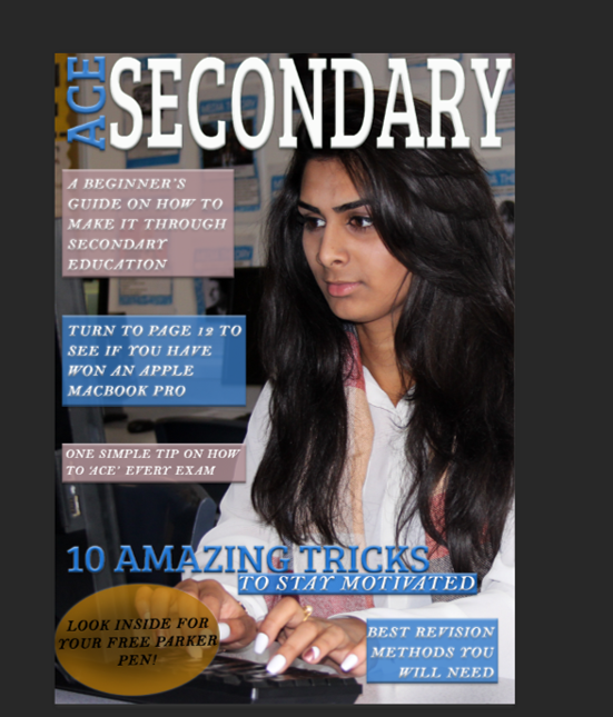
Click the Prezi above to see how I produced my magazine cover. This was my first time using Photoshop ever so I am quite surprised with the result however I am simply satisfied with the results, not glad, just satisfied due to the fact that I was not exactly happy with my magazine cover due to changed I could have made with image choice and font choice, however, I believe I did quite well knowing the time frame I had to have it completed by along with all my blog work. Learning Photoshop was certainly a new experience and I would like to continue using it during my time throughout Media Studies as it is a fun software to fiddle with until you have exactly what you want. I think that if I had managed my time a little better and had a little more time, I would have come up with a much better magazine but I cannot change that now so I will just have to do with what I have. It took me a while to get the hang of Photoshop but when I did, I found it a lot more simpler and could navigate and make necessary edits really quickly whereas in the beginning of my time studying Media, I really struggled so I feel a sort of satisfaction that I learnt a wide range of skills and vocabulary related to media.


PRELIM TASK: Final front cover/Audience feedback


As you can see, I made a few changes from the front page I thought I was going to have to the one  I actually would like to use. I edited the graphic in the bottom left corner turning it from yellow to red. I did this because I was told that the yellow doesn't really go with my colour scheme so I was advised by my peer to search for a colour wheel and whichever colour is opposite to the most used colour in my front cover, use that as it will definitely stand out more so I tried this and now strongly believe that it was a good change to make as it does really stand out. Furthermore, I duplicated the layer with the text of 'Look inside for your free Parker pen' as it made it stand out more because it made the black bolder meaning it is easier to read and will catch the reader's attention as people would like freebies if they are paying for something.

In addition to this, I was advised to add a picture of the prize that could have been won (a Macbook Pro) which made my front cover stand out more as I looked online and deconstructed other magazines which allowed me to come across this technique various times in various magazines. I did this so there was more on my page as it looked slightly empty. This made the perfect addition to my front cover because it filled up the page more and the colours on its screen are similar to the colours on the scarf of my model.

Lastly, I changed the text from 'A beginner's guide on how to make it through secondary education' to 'A beginner's guide on how to achieve more success!'. I did this because Mr. Varghese told me that the first line of text seemed as if anybody can make it and seemed childish. Although Mr. Varghese is not my target audience, I trust his advice as he has ten years of past experience in Media Studies classes and also, I asked younger students as to which they piece of text they found more attractive and most of the students chose that the second piece of text was better as it seemed more friendly due to the use of punctuation (the exclamation mark) and the fact that 'Secondary' wasn't used again which is bad because it felt as if the word 'Secondary' was repeated quite a few times even though it was only used twice. I used younger students, in years 9,10 and 11 as this magazine is targeted at them because they are reaching the middle/end of their secondary school careers meaning they will be doing their GCSEs soon.

PRELIM TASK: Final shots (front page and contents)


I chose these images as the models look as if they are in a normal environment and doesn't look unrealistic so the people who read the magazine don't feel as if the models are trying to forcefully impress. Also, each of these pictures allow me to use different colours meaning I have the ability to match each of them with my colour scheme especially those on the contents page as the front page and contents page need to link due to the fact that they should look as if they are from one magazine. Furthermore, the mis-en-scene of each image is very natural due to the objects such as computers, sofas, bags, people, etc. This naturalistic mis-en-scene creates tranquillity and the models look very happy which links to my title of 'Ace Secondary'. It links because people who do/did well in their exams will be happy due to the fact that they must have worked hard and this magazine will teach students of GCSE level how to do so. Lastly, I used sixth form students because they recently completed their GCSEs which is ideal because I am aiming this magazine at students of GCSE level which allows them to trust the magazine as the people seen on it are those with first-hand experience.