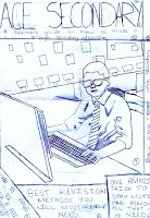
Flat plan for magazine cover:
Created magazine cover:
The layout for my final piece matches my flat plan because the background image and masthead are similarly placed. However I changed the location of the text boxes as they blocked a key part of the image being used on my magazine front cover. Also, the text stood out more where I placed it on Photoshop rather than on my flat plan due to the fact that it is in a more obvious position meaning it is easier and quicker to read. Furthermore, I didn't leave the text boxes along the bottom and top of the page as I did in my flat plan as it looked clustered when I did. Also, I decreased the opacity of each text box so the reader could faintly see the image rather than having rectangle blocks blocking the image which would have decreased the realism of the magazine cover.
In my opinion, I completed this front page really well analysing the time I had to complete it. However, the next time I make a magazine cover, depending on the topic it'll be on, I will aim to have more colours meaning the colour scheme will be a lot more vibrant and eye catching. I couldn't really do that with this magazine cover because it is for school students and if I added a lot of colours, the professionalism of the work would have decreased highly which is moving away from the real media text I am aiming to produce.
Lastly, I changed the gender of the person I was using in my front cover as I go to a girl's school meaning it was hard to get hold of a male student in formal clothing as the dress code is 'smart casual' and this student volunteered to take the picture instead as she was in the appropriate attire.
Thanks for visiting again, any feedback would be greatly appreciated.


No comments:
Post a Comment