Click the Prezi above to see how I produced my magazine cover. This was my first time using Photoshop ever so I am quite surprised with the result however I am simply satisfied with the results, not glad, just satisfied due to the fact that I was not exactly happy with my magazine cover due to changed I could have made with image choice and font choice, however, I believe I did quite well knowing the time frame I had to have it completed by along with all my blog work. Learning Photoshop was certainly a new experience and I would like to continue using it during my time throughout Media Studies as it is a fun software to fiddle with until you have exactly what you want. I think that if I had managed my time a little better and had a little more time, I would have come up with a much better magazine but I cannot change that now so I will just have to do with what I have. It took me a while to get the hang of Photoshop but when I did, I found it a lot more simpler and could navigate and make necessary edits really quickly whereas in the beginning of my time studying Media, I really struggled so I feel a sort of satisfaction that I learnt a wide range of skills and vocabulary related to media.
Wednesday 5 October 2016
PRELIM TASK: Step by step production of my front cover
Click the Prezi above to see how I produced my magazine cover. This was my first time using Photoshop ever so I am quite surprised with the result however I am simply satisfied with the results, not glad, just satisfied due to the fact that I was not exactly happy with my magazine cover due to changed I could have made with image choice and font choice, however, I believe I did quite well knowing the time frame I had to have it completed by along with all my blog work. Learning Photoshop was certainly a new experience and I would like to continue using it during my time throughout Media Studies as it is a fun software to fiddle with until you have exactly what you want. I think that if I had managed my time a little better and had a little more time, I would have come up with a much better magazine but I cannot change that now so I will just have to do with what I have. It took me a while to get the hang of Photoshop but when I did, I found it a lot more simpler and could navigate and make necessary edits really quickly whereas in the beginning of my time studying Media, I really struggled so I feel a sort of satisfaction that I learnt a wide range of skills and vocabulary related to media.
PRELIM TASK: Final front cover/Audience feedback
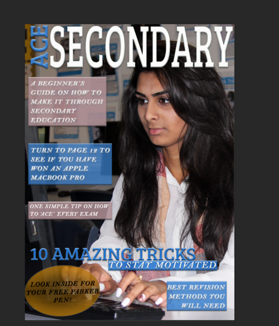

As you can see, I made a few changes from the front page I thought I was going to have to the one I actually would like to use. I edited the graphic in the bottom left corner turning it from yellow to red. I did this because I was told that the yellow doesn't really go with my colour scheme so I was advised by my peer to search for a colour wheel and whichever colour is opposite to the most used colour in my front cover, use that as it will definitely stand out more so I tried this and now strongly believe that it was a good change to make as it does really stand out. Furthermore, I duplicated the layer with the text of 'Look inside for your free Parker pen' as it made it stand out more because it made the black bolder meaning it is easier to read and will catch the reader's attention as people would like freebies if they are paying for something.
In addition to this, I was advised to add a picture of the prize that could have been won (a Macbook Pro) which made my front cover stand out more as I looked online and deconstructed other magazines which allowed me to come across this technique various times in various magazines. I did this so there was more on my page as it looked slightly empty. This made the perfect addition to my front cover because it filled up the page more and the colours on its screen are similar to the colours on the scarf of my model.
Lastly, I changed the text from 'A beginner's guide on how to make it through secondary education' to 'A beginner's guide on how to achieve more success!'. I did this because Mr. Varghese told me that the first line of text seemed as if anybody can make it and seemed childish. Although Mr. Varghese is not my target audience, I trust his advice as he has ten years of past experience in Media Studies classes and also, I asked younger students as to which they piece of text they found more attractive and most of the students chose that the second piece of text was better as it seemed more friendly due to the use of punctuation (the exclamation mark) and the fact that 'Secondary' wasn't used again which is bad because it felt as if the word 'Secondary' was repeated quite a few times even though it was only used twice. I used younger students, in years 9,10 and 11 as this magazine is targeted at them because they are reaching the middle/end of their secondary school careers meaning they will be doing their GCSEs soon.
PRELIM TASK: Final shots (front page and contents)


I chose these images as the models look as if they are in a normal environment and doesn't look unrealistic so the people who read the magazine don't feel as if the models are trying to forcefully impress. Also, each of these pictures allow me to use different colours meaning I have the ability to match each of them with my colour scheme especially those on the contents page as the front page and contents page need to link due to the fact that they should look as if they are from one magazine. Furthermore, the mis-en-scene of each image is very natural due to the objects such as computers, sofas, bags, people, etc. This naturalistic mis-en-scene creates tranquillity and the models look very happy which links to my title of 'Ace Secondary'. It links because people who do/did well in their exams will be happy due to the fact that they must have worked hard and this magazine will teach students of GCSE level how to do so. Lastly, I used sixth form students because they recently completed their GCSEs which is ideal because I am aiming this magazine at students of GCSE level which allows them to trust the magazine as the people seen on it are those with first-hand experience.
Monday 3 October 2016
PRELIM TASK: Contents page
Final magazine cover:

Final contents page:

These are my two final pieces of work. Analysing my contents page, I can see there is cohesion between my magazine cover and contents page. The graphic in the bottom left hand corner of my magazine cover links with the contents page as there are several red sofas within the images. I made this specific link as I didn't have much on my contents page which matched with my front cover due to the fact that the image as I used on the front cover was quite plain but I had to do with what I had and came up with this. Also, within the images of the contents page, my models are wearing quite a lot of blue which connects with my magazine cover as you can see there are light blue text boxes along with display up in the mis-en-scene with blue in it. I know this worked because I was told by Mr. Varghese that if you want two colours to go together, you either choose a lighter or darker version of the same colour so I did exactly this and asked my models to wear these specific colours. I was also told by Mr. Varghese that if you want something to stand out, use the opposite colour to create the shape, etc. that you would like to stand out hence why I used the blue and red because if you analyse a colour wheel (look at the one below), you will see that blue and red are exact opposites which is why I chose this background to take these photos in.
Furthermore, the text used in each page are exactly the same. I did this so the pages didn't look like they belonged in completely separate magazines because if I used Times Roman with the Italic font I used, it wouldn't have looked right because it would be completely opposite meaning they would clash and move my work away from looking professional and like real media text. Lastly, I placed the name of the magazine on the contents page as well as obviously the front cover to make an obvious link with both of these pages.
I got the colour of the grey from the shirt of the front cover's model and darkened it a little because if I didn't, any white text such as 'Secondary' would not have shown up which as said before, decreases professionalism which also means my magazine cover and contents would not look like real media text.

PRELIM TASK: Magazine front cover

This is my finished magazine cover. I added in the oval in the bottom left hand corner as I was advised from Mr Jones to do so as it would fill up the cover more. Also, placing the yellow on the cover allows there to be a wider variety of colours so it doesn't look plain and there isn't as much empty space. I chose the picture of a young girl as it relates to my target audience. the magazine isn't specifically for any gender, I just had to change the image I used to a girl's picture as I go to a girls school and there aren't many boys so I couldn't get a hold of one in formal clothing.
Subscribe to:
Posts (Atom)