Friday, 30 September 2016

PRELIM TASK: Manipulation of mast head


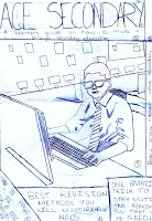
Firstly, I had my masthead horizontal. However, it didn’t really stand out so I changed the design and placed the word ‘Ace’ vertical and increased the size of the word ‘Secondary’ making it stand out as it is now bigger than the rest of the text unlike before where it was a similar size to the rest of the text making it difficult to distinguish between the masthead and other text which are present on the front page. Also, I changed the colour of the word 'ACE' so it would stand out a little more as well as match my colour scheme. I couldn't find a school magazine with the same layout as my masthead but I found a music magazine with a similar design. I changed which side the vertical text was on because 'Secondary' would become too small if I placed it vertical and seeming 'Ace' is a short word, it allowed me to increase the size of the text so it could be read.

Furthermore, after I obtained my first masthead, Ms. Collins said that it looked very plain and simple. Although my teacher isn't a student, she has been doing these magazines with students for quite a few years now which is a sort of expert opinion and knowing this, I believed her opinion was very valuable as she has probably seen the best and worst work. To make sure Miss was right, I asked my peers in my class who also said that the first masthead I made looked very plain and simple, it didn't catch their eye either. They said that the edited version looks a lot better as it has more colour to match the colour scheme and relate to the rest of the front cover. Knowing from personal experience, as I am a student, I know that if the masthead isn't attractive, I most likely won't even open the magazine. So keeping this in mind, I chose to listen to the criticism I obtained and changed it accordingly. Making these changes allowed me to draw closer to making my masthead look more like real media text which is my main goal.


I chose the title 'Ace Secondary' because every student wants to do well in secondary school and the word 'ace' means to excel in a certain field but in this concept, an exam. This relates to  my magazine because it is designed for students in secondary school who are just about to sit their GCSE exams which are the exams a student sits at the end of their secondary education. In addition to this, 'Ace Secondary' has never been used before meaning it is unique and the words 'Ace' and 'Secondary' go really well together.

Thanks for visiting again.
See you next time.

PRELIM TASK: Why I chose this image and model consent form

The image I chose for my magazine cover:


I chose this image as it represents an advance in technology and that the school is keeping up with these advances and it isn't the normal book and pen, computers are used which are a more recent creation. Also, this image relates to the target audience who are young students and the person in the picture is young and also a student. As the model relates with students, the magazine itself is more attractive to young people because there is somebody just like them on the front cover and not and adult who the student may assume that doesn't understand their point of view school wise and just generally. Also, I chose this image as it is in a school environment showing briefly what the magazine is going to be about (doing school work and revision). I made sure there weren't various colours present in the background as this would have made the magazine look unprofessional meaning this has a professional approach from a real media text.

This was just a quick update, see you next time.


Thursday, 29 September 2016

PRELIM TASK: Flat plan compared to real layout/Cover layout decisions


 Flat plan for magazine cover:
Created magazine cover:

The layout for my final piece matches my flat plan because the background image and masthead are similarly placed. However I changed the location of the text boxes as they blocked a key part of the image being used on my magazine front cover. Also, the text stood out more where I placed it on Photoshop rather than on my flat plan due to the fact that it is in a more obvious position meaning it is easier and quicker to read. Furthermore, I didn't leave the text boxes along the bottom and top of the page as I did in my flat plan as it looked clustered when I did. Also, I decreased the opacity of each text box so the reader could faintly see the image rather than having rectangle blocks blocking the image which would have decreased the realism of the magazine cover.

In my opinion, I completed this front page really well analysing the time I had to complete it. However, the next time I make a magazine cover, depending on the topic it'll be on, I will aim to have more colours meaning the colour scheme will be a lot more vibrant and eye catching. I couldn't really do that with this magazine cover because it is for school students and if I added a lot of colours, the professionalism of the work would have decreased highly which is moving away from the real media text I am aiming to produce.

Lastly, I changed the gender of the person I was using in my front cover as I go to a girl's school meaning it was hard to get hold of a male student in formal clothing as the dress code is 'smart casual' and this student volunteered to take the picture instead as she was in the appropriate attire.

Thanks for visiting again, any feedback would be greatly appreciated.

Wednesday, 28 September 2016

PRELIM TASK: Shot lists and Flat plan

Below will be my flat plan. I intend to make the front cover of my magazine to look like this. It is short and simple allowing the reader of this magazine to easily figure out what the magazine will consist of. I may make a few adjustments to the design however, the text and the layout will mostly look the same.

As you can see in my shot list for my front cover, I have used mostly medium shots and close ups to ensure the model stands out allowing the audience to quickly identify the magazine and whether it has relevance to them or not. I drew these shot lists to have a brief plan of what type of pictures I could possibly take and place on my front cover allowing for me to actually take the pictures quicker as I will know all the shots I need to use.

On the other hand, for my contents page I used more medium and long shots so the person reading the magazine can actually see what there is to offer and how the school looks. Also, having nature in the mis-en-scene has a tranquil effect which makes it more suitable for the audience as they will most probably be reading the magazine in order to ensure success without panicking, etc.
Furthermore, in my shot lists I provided the following information:
  Shot type               Location                   Model             Mis-en-scene

`  
Flat plan for magazine cover:
Shot list for magazine cover:

Shot list for contents page:

     
    Thanks for coming back, I appreciate it. If you have any feedback, simply drop it on the comments section as it would mean a lot and allow me to edit it too. Bye.

Tuesday, 27 September 2016

PRELIM TASK: Image adjustments

Unedited image:
 Edited image:
The only edit I made on my image was the brightness as it was a little dim in the beginning so I adjusted the brightness to make it a little brighter so the front cover stands out more and looks more attractive. Adjusting the brightness allowed the hair colour to be richer and darker so it also stood out more and looked a lot better than the unedited version. Adjusting the brightness also allowed the background colours to be brighter so I could choose colours better as I needed to choose colours which were already present in the picture and you can see that the blue is brighter, the yellow is too and so is the red.

Monday, 26 September 2016

PRELIM TASK: Reader Profile


This is my reader profile. I chose this person for it as she is the ideal reader because she is studying her GCSEs and would like to know how to do well. Also, this magazine gives her advice on how to approach the stress of exams and how to revise without feeling demotivated/bored. Keeping this in mind, she feels as if when she revises a lot, she seems to lose the social aspect of her life which she believes she needs due to the fact that if she doesn't socialise with others, she feels like there is no benefit of revising so I will be making this magazine targeting students like this to help them enjoy their time in secondary school as much as possible and do as well as possible too.

Sunday, 25 September 2016

PRELIM TASK: Magazine deconstruction

Hey everyone, good to know you're back again. This was my attempt at deconstructing a magazine cover. I had to complete this task for my preliminary task and to help me have a taste of what I need to include in the magazine I will be creating. Completing this task has aided me in learning a range of new vocabulary and their definitions. I chose this magazine cover as I am interested in fitness which also allowed me to enjoy doing this task as it relates to me.

Hope you enjoyed!

See you later!

PRELIM TASK: Introduction to my blog

Hi and welcome to my blog for media studies. I’ll be presenting all of the work I complete in year 12 on this page so if you’re interested, pay a visit, I guarantee it’ll be worth your while. I believe Media as a whole is an amazing creation of man as it interconnects the whole world whether it’s through music, adverts or in this case, magazines.
I have currently been assigned a preliminary task which I have to complete by the 30th of September giving me just under a week to complete it. During my briefing, I was told to produce a magazine cover and contents page for a school or college. Now, you may be thinking that it’ll be a simple task if you haven’t studied Media previously but believe me, there is a lot more to it than just putting titles and pictures together. I will be including pictures of a student, maybe more alongside all the normal features a magazine would have. I have to include my own photos and edit these using Photoshop which I am extremely excited about as I have always wanted to learn how to use it.
So as I said before, pay a visit every now and again, I will be uploading regularly meaning there will always be fresh content for you to look at. Wish me luck, I think I’ll be needing it.


Thanks for reading! Hopefully I’ll catch you again but until then, make sure to stay safe, bye.